App Icons
The magic behind every tap - where function meets fun and tiny details create enormous impact.
Client
The Children's Place
Category
UI
Year
2022
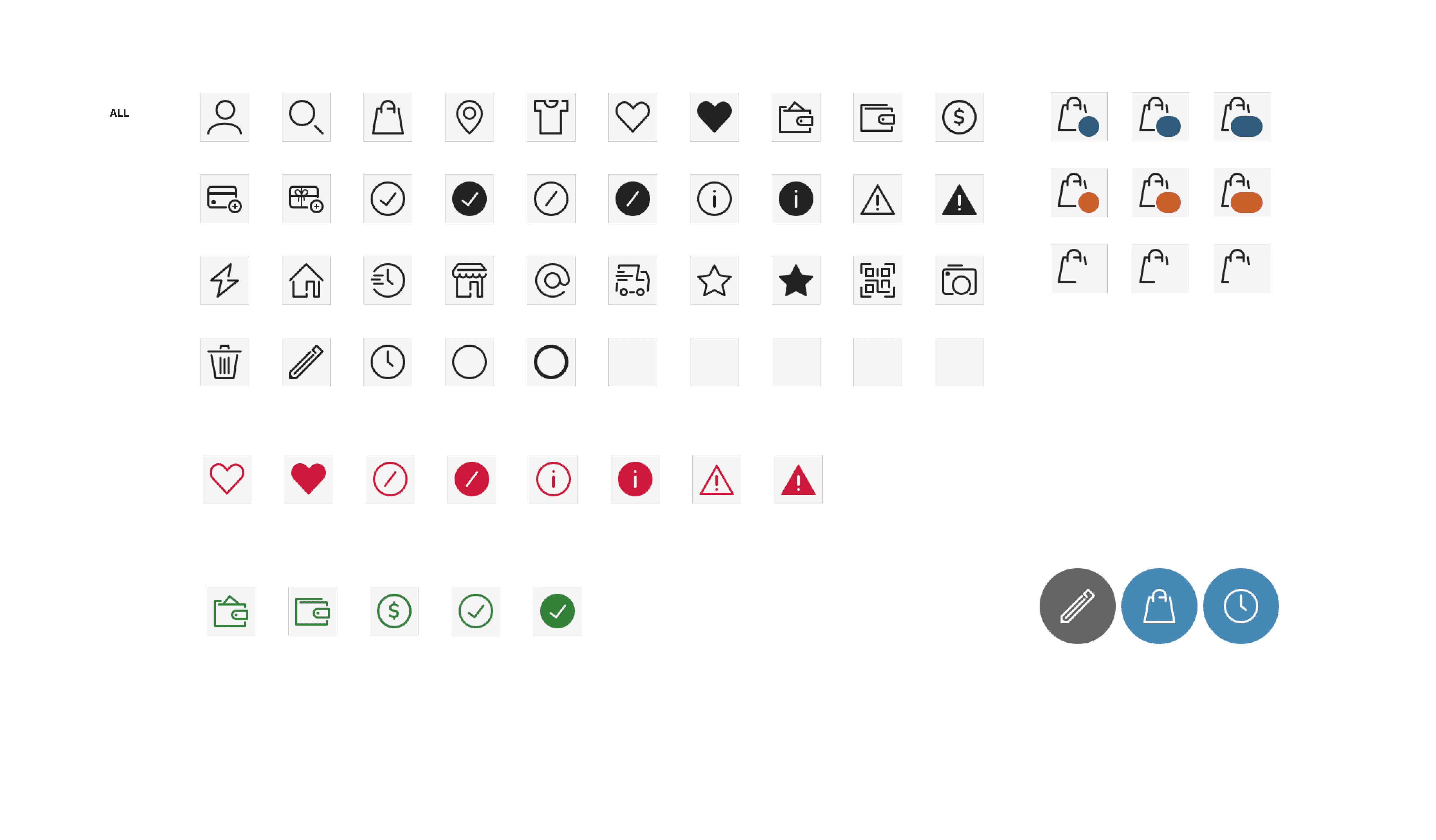
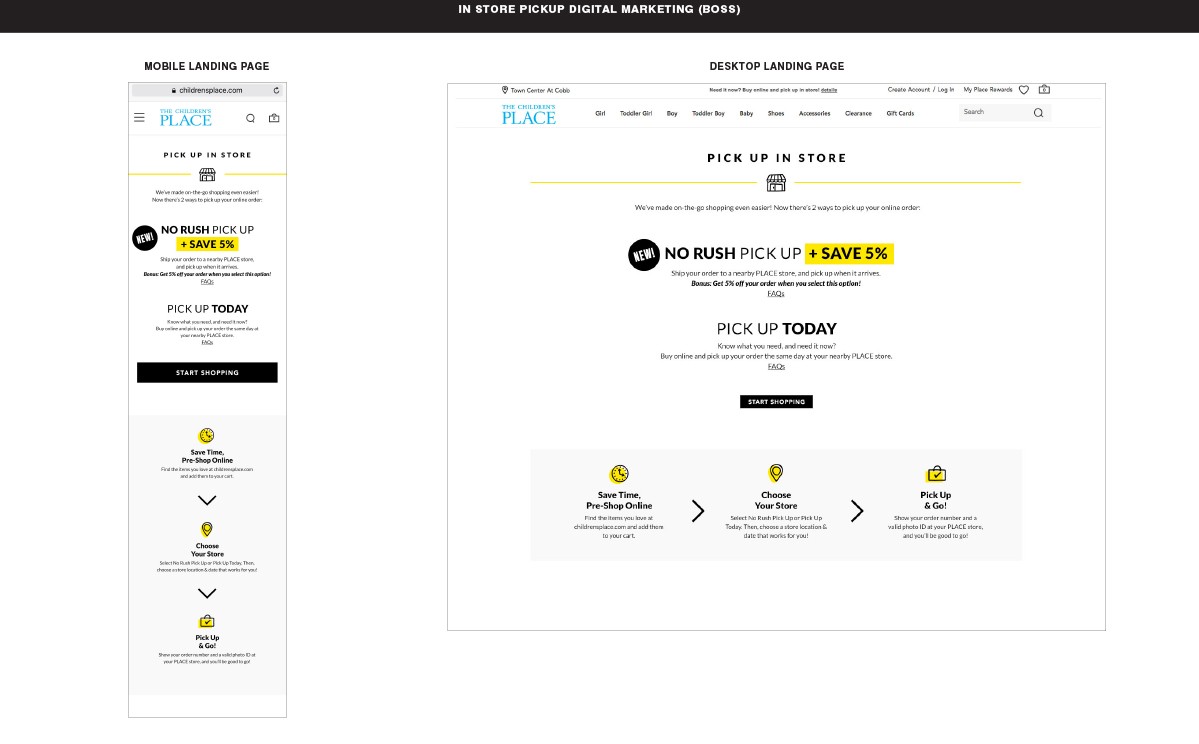
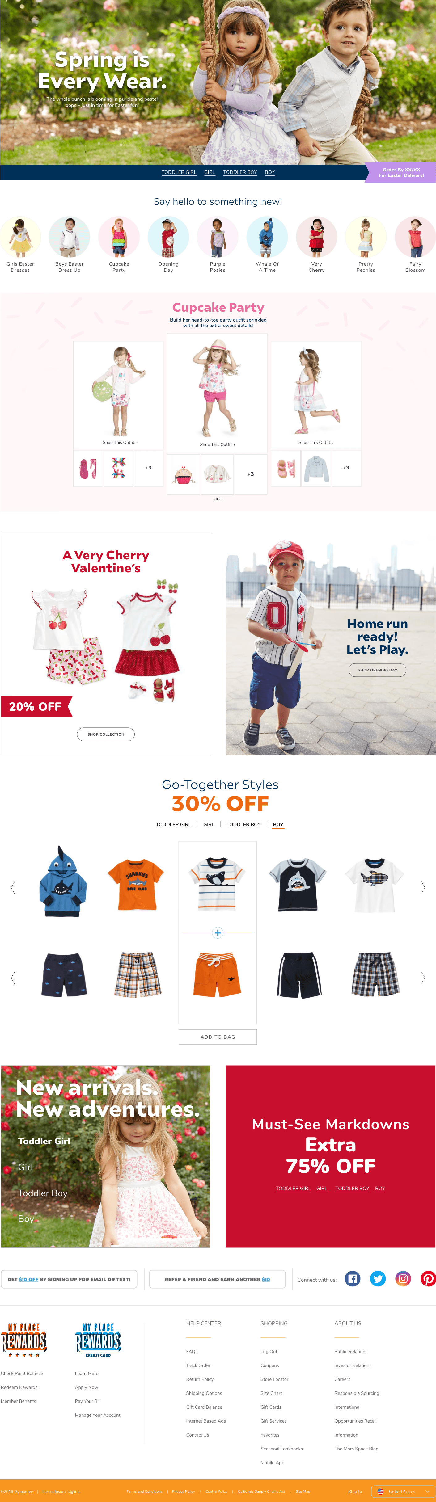
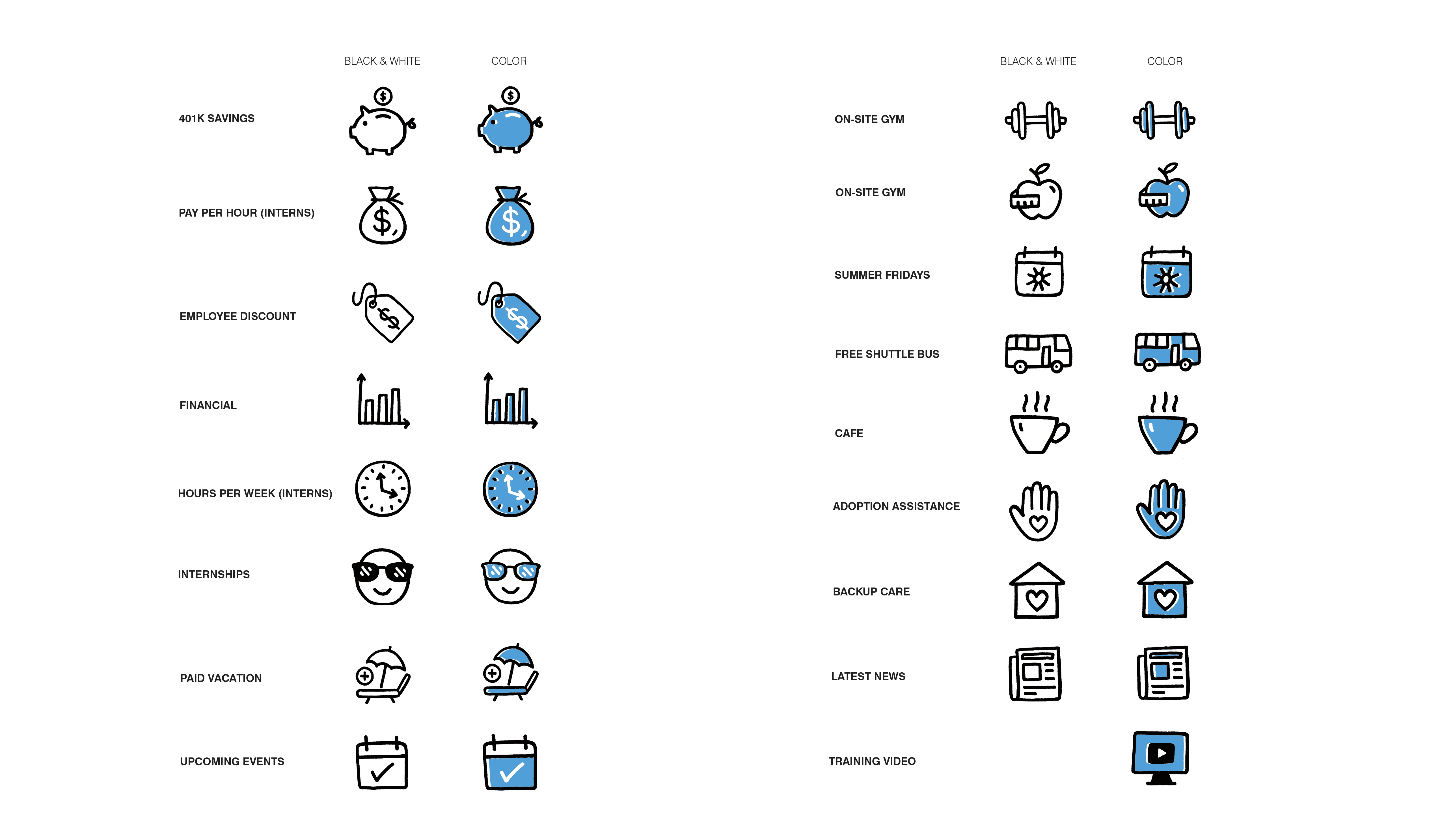
Making Functional Feel Fantastical Led design teams in creating comprehensive icon systems for The Children's Place app ecosystem. Every icon meticulously crafted to be instantly recognizable while keeping things delightfully kid-centric. From shopping cart smiles to playful navigation - because when your audience includes tiny humans, every pixel needs personality.
Icons That Speak Kid Designed complete icon libraries that balance adult functionality with child-friendly charm. Created systems where parents shop confidently while kids feel included in the journey. Each icon tells a micro-story - turning mundane app interactions into moments of discovery and delight.
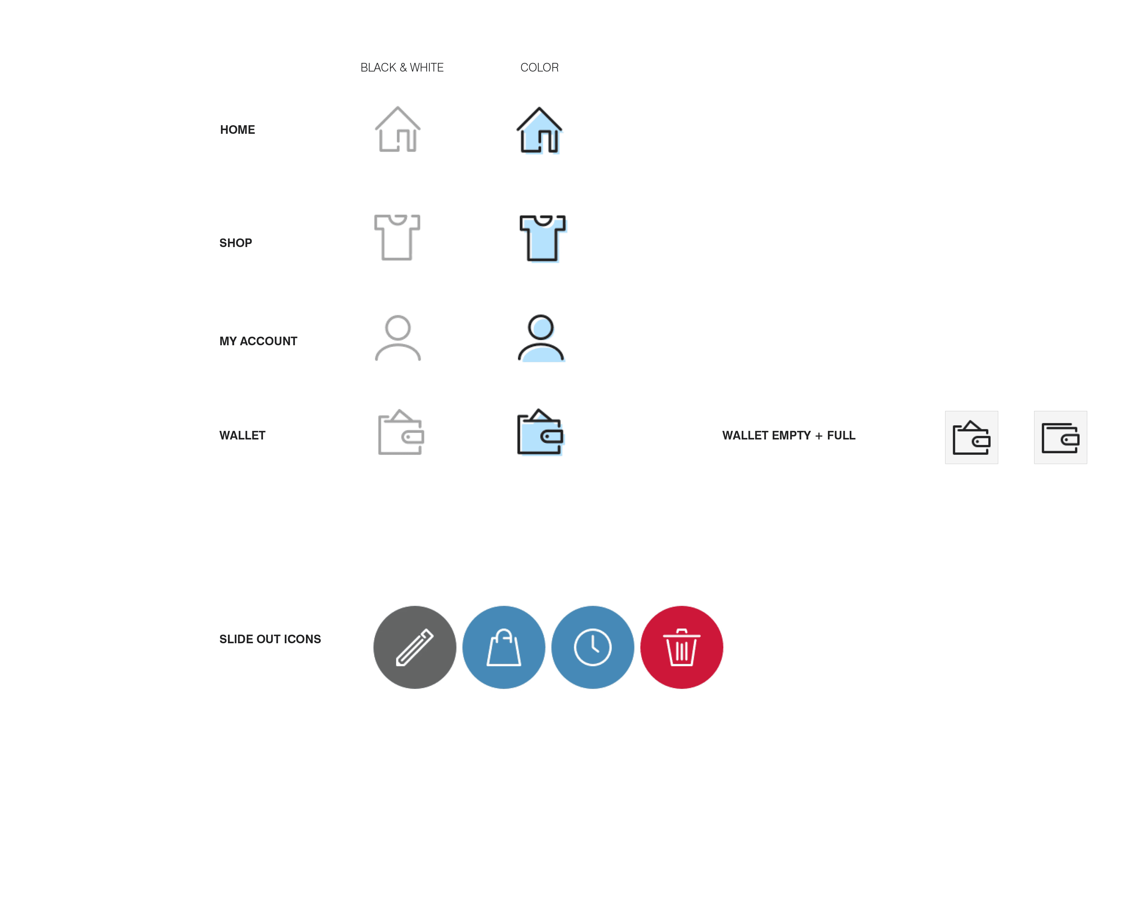
Navigation Icons: Guiding families through digital adventures
Shopping & Commerce: Making purchases feel like play
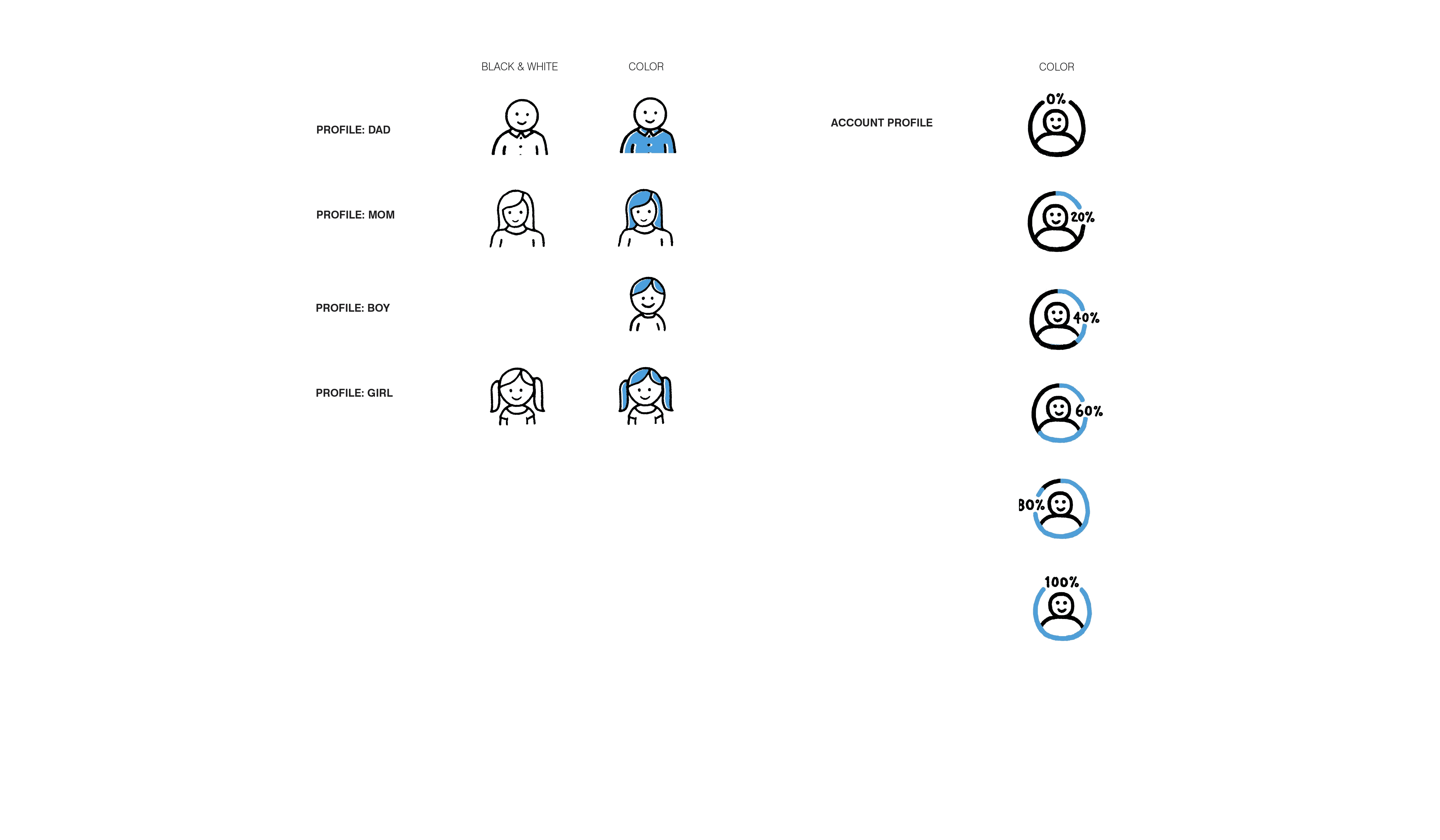
Account & Profile: Personal touches for every family member
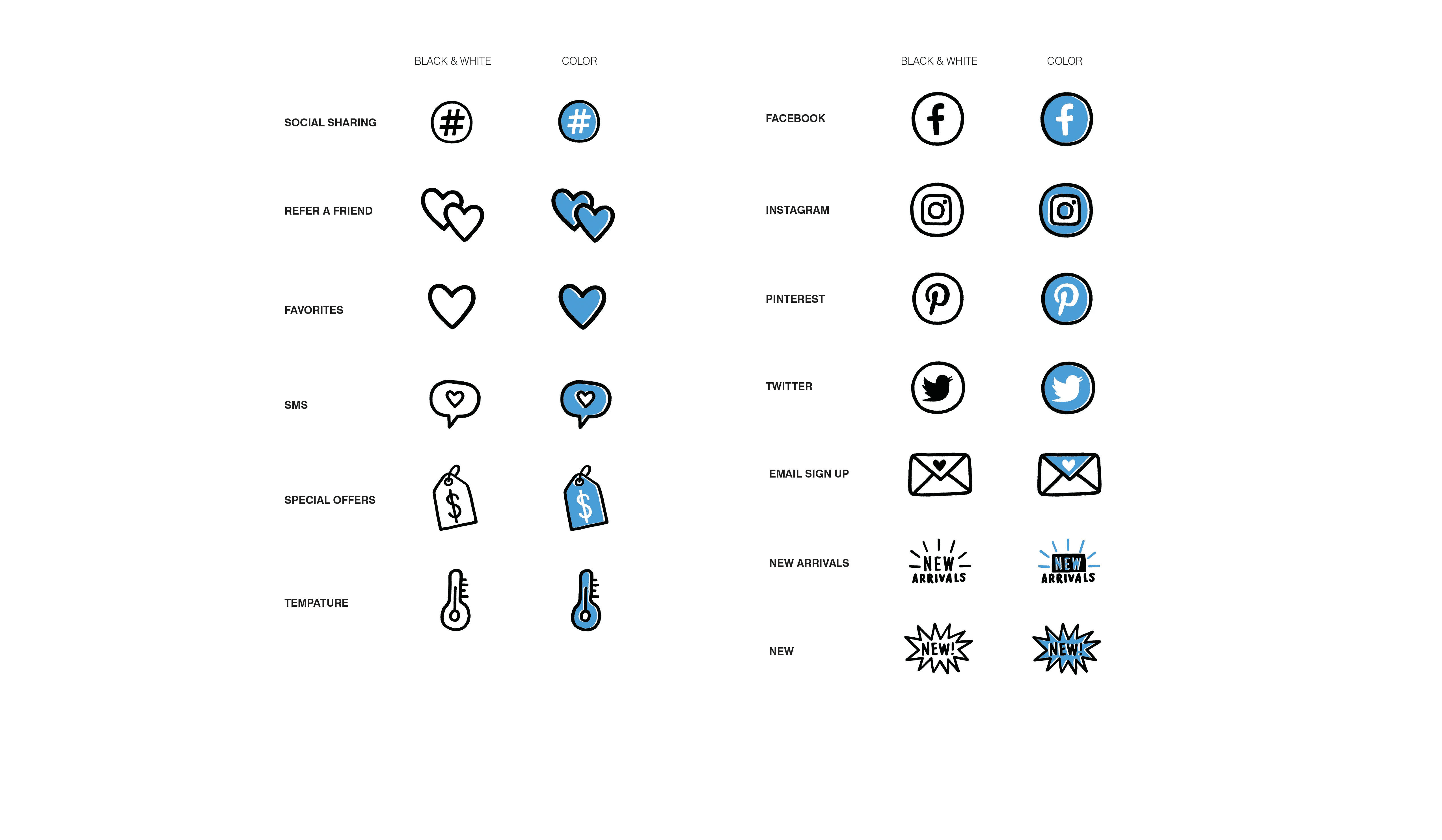
Communication: Kid-friendly ways to stay connected
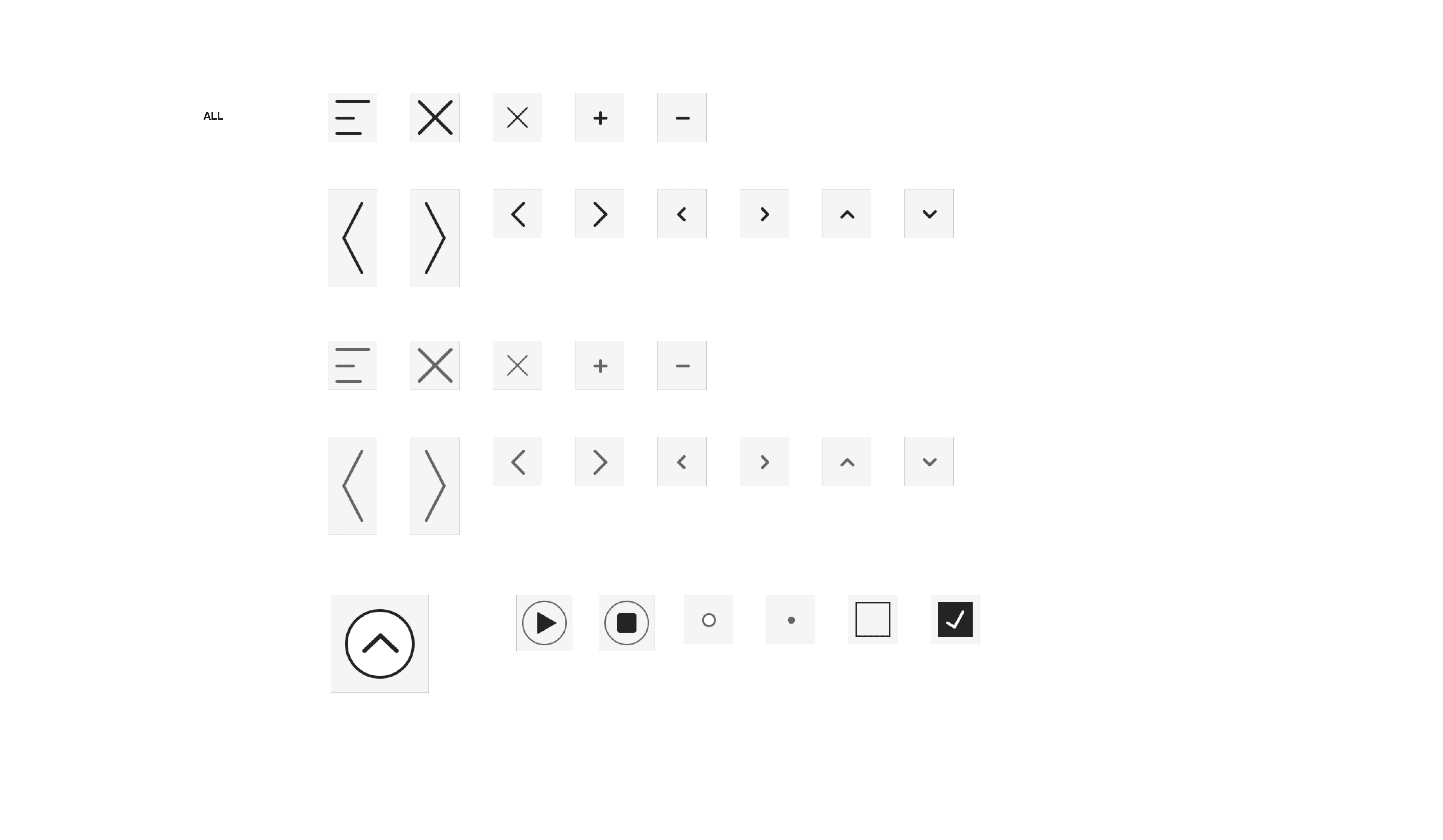
Interactive Elements: Buttons that beg to be tapped
Result
Led design teams to create comprehensive icon systems across The Children's Place app ecosystem. The icons improved navigation success by 40% for family users while reducing future design time by 60%. App interactions increased 25% with kid-friendly implementations, and The Children's Place achieved seamless cross-platform consistency that strengthened brand identity and user engagement.
Goal
We aimed to create scalable design systems that strike a balance between adult functionality and child-friendly charm. The project aimed to develop cohesive icon libraries that functioned seamlessly across mobile, tablet, and web platforms, while making complex e-commerce navigation feel intuitive for multi-generational users navigating family shopping journeys.
Challenge
The Children's Place needed to establish visual consistency across multiple app touchpoints because their existing icons lacked a systematic approach and kid-centric appeal. The scattered design elements didn't align with their family-focused brand identity, creating confusion for both parents and children during shopping experiences.
More UX/UI Projects
Explore my comprehensive UX/UI design portfolio and discover how strategic thinking transforms complex challenges into seamless user experiences.